The color palette is one of the most important aspects of the design of the kitchen. The base of the whole ensemble is a headset, to which you need to choose a harmonious finish, equipment and accessories. In addition to the color and texture of the surfaces, the design of the cooking room also depends on the proportions, shapes, lines, layout, but still the dominant shade has a direct impact on the atmosphere in the house and the mood of the owners. How to choose the best coloring of the kitchen will be discussed below.
1. Quantity and proportions
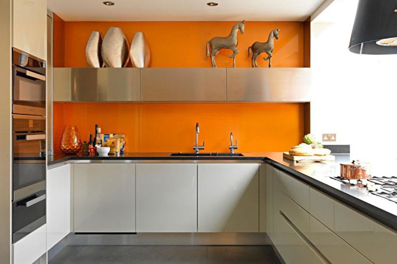
According to the general rule of design, it is recommended to use no more than 2-3 colors in the interior of one room. Moreover, their ratio should be different, for example, a light base covering 60–80% of surfaces, dark edging (10–30%) and bright accents (up to 10%).
2. Comfortable details
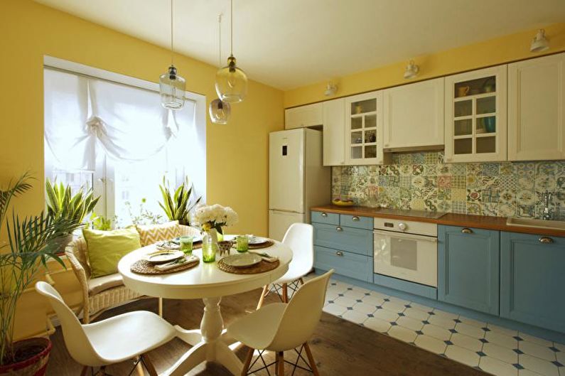
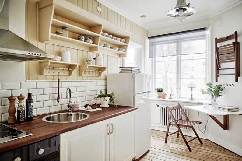
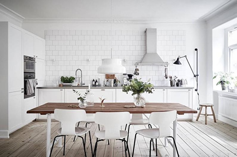
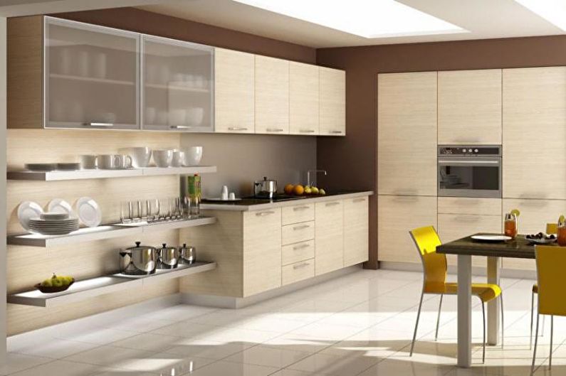
To visually increase the space, the kitchen is traditionally decorated in bright colors. To ensure that the snow-white, steel, mint green or pale blue atmosphere does not leave the impression of a sterile laboratory, it should be supplemented with natural materials (wood, stone) or diluted with warmer colors - beige, orange, brown, green.
3. Clear framework
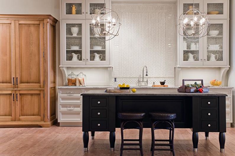
The smaller the area of the kitchen, the more carefully you should handle dark and saturated colors. They can successfully perform the function of a kind of framing, located on horizontal surfaces (countertops) and along the edges of the furniture. The headset with narrow contrasting contours around the perimeter will look compact and graphic.
4. Interaction with the sun
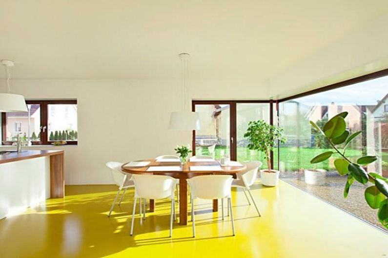
When choosing a color scheme for the kitchen, it is very important to focus on natural lighting. So, calm pastel colors will help to slightly cool the room with the window to the south, and to compensate for the lacking sunlight, it is worth choosing yellowish paints and wood in warm colors.
5. The combination of surfaces
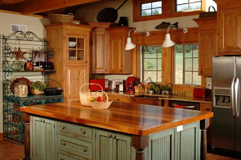
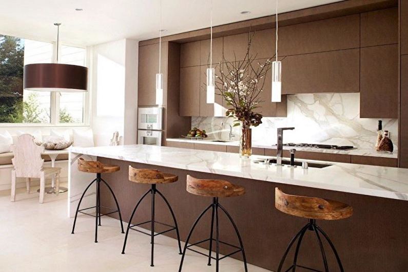
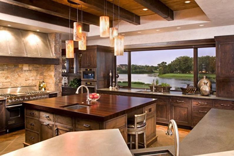
Depending on the texture of the material, the same color may look completely different. This fact should always be considered when combining kitchen items. For example, the rough texture of stone or brick in the decoration will perfectly combine with the country set of roughly processed boards, and the varnished gloss will perfectly complement glass and chromed metal.
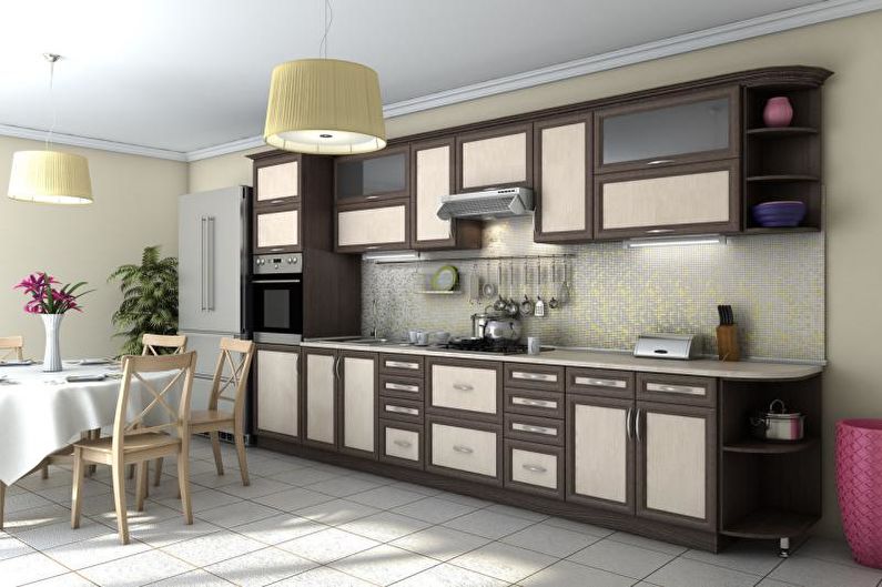
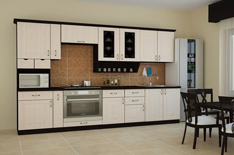
6. Alternating shades vertically
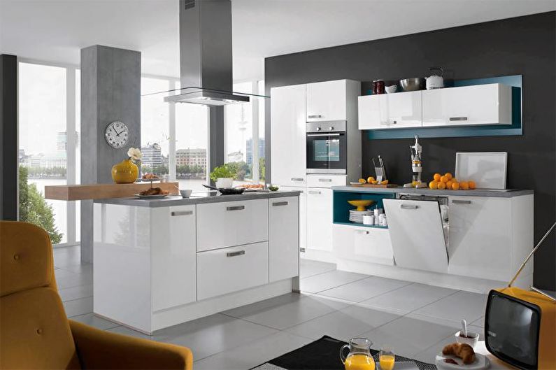
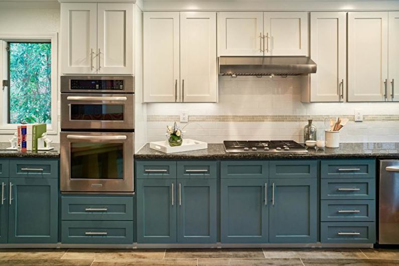
When purchasing a set whose facades are painted in several colors, it is better to give preference to models in which the upper cabinets are lighter than the lower ones. In the opposite case, there is a risk of visually reducing the height of the room and violating comfortable proportions.
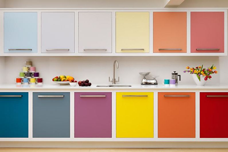
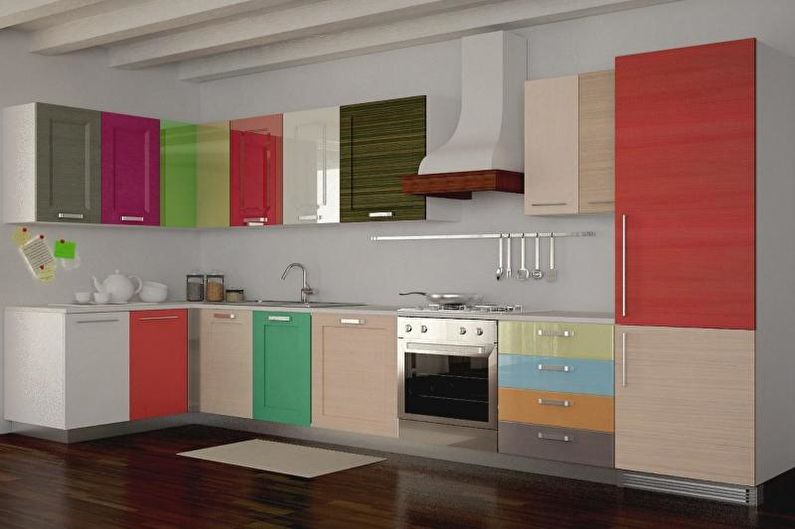
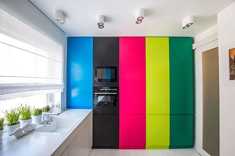
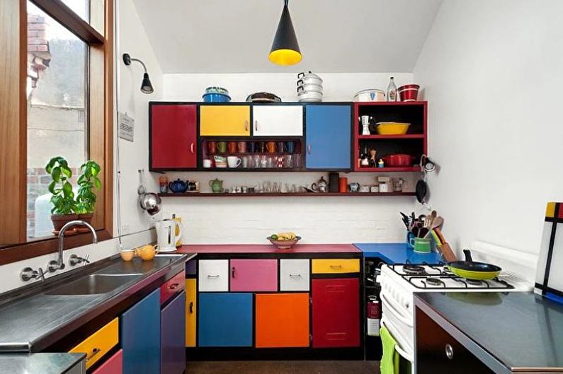
7. Seven colors of the rainbow
The rainbow spectrum, as well as just an abundance of bright inserts, will be appropriate in a spacious kitchen. At the same time, it is recommended to abandon any patterns, decor, open shelves and noticeable fittings. The multi-colored cooking zone itself looks very active, so do not overload it with unnecessary details. The finish in this case should be neutral, plain.
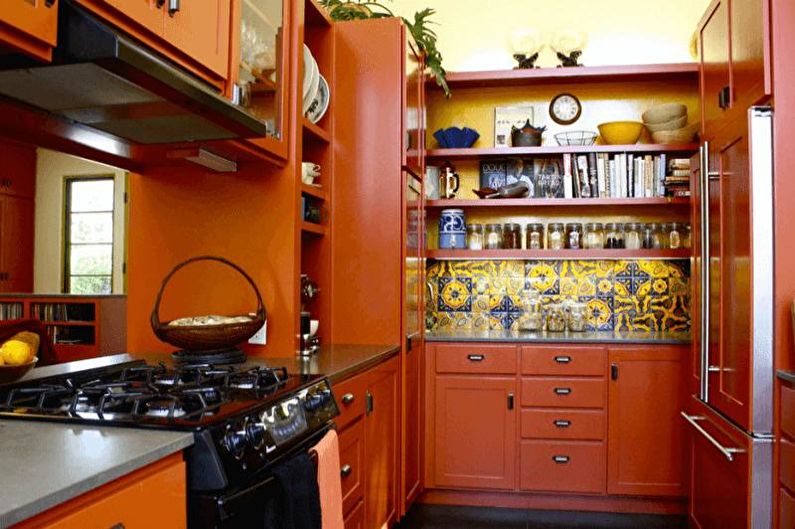
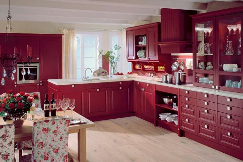
8. Taste shades
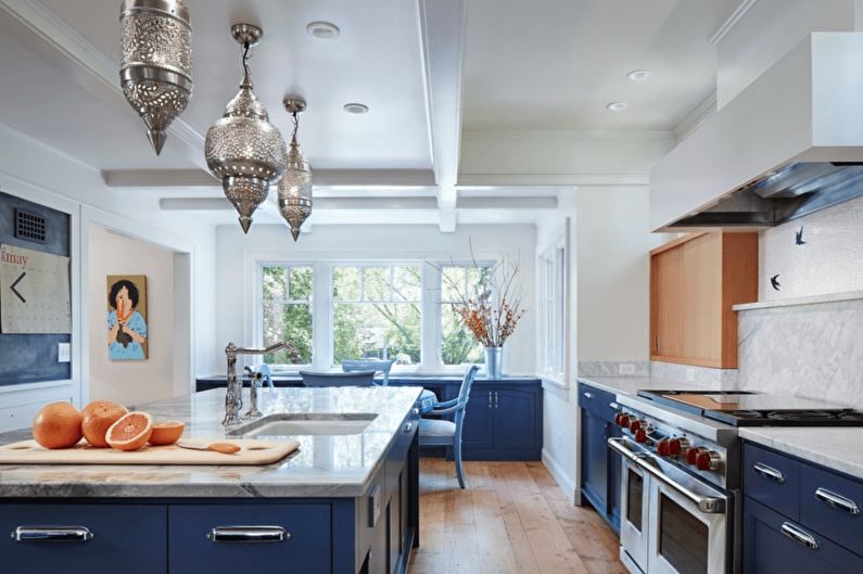
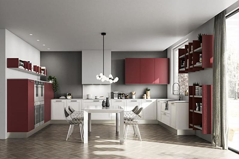
Causing association with food, the color of the kitchen directly affects the appetite. Saturated fruit and berry tones (orange, scarlet, tomato red, lime, raspberry) increase the unconscious craving for edible reserves, while winter shades of blue, turquoise, purple, emerald dull the feeling of hunger.
9. Subconscious perception of colors
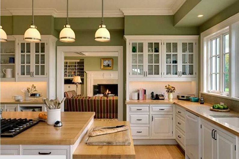
To make all family members feel comfortable in the kitchen, it is better to design it in a natural palette. Calm gray-brown, beige, sandy, grassy-green tones with a matte texture are perceived as safe, while too bright, unnaturally light or too gloomy surroundings quickly cause mental fatigue.
10. Spices in design
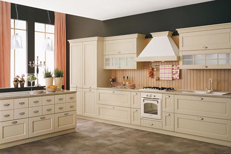
The inspiration for the neutral-warm design of the cooking zone can be found in the products themselves. All kinds of shades of spices, coffee, chocolate, seasonal vegetables, fruits and berries will make the kitchen the warmest and most comfortable room in the whole house, where you want to spend more time and come up with new delicious dishes.
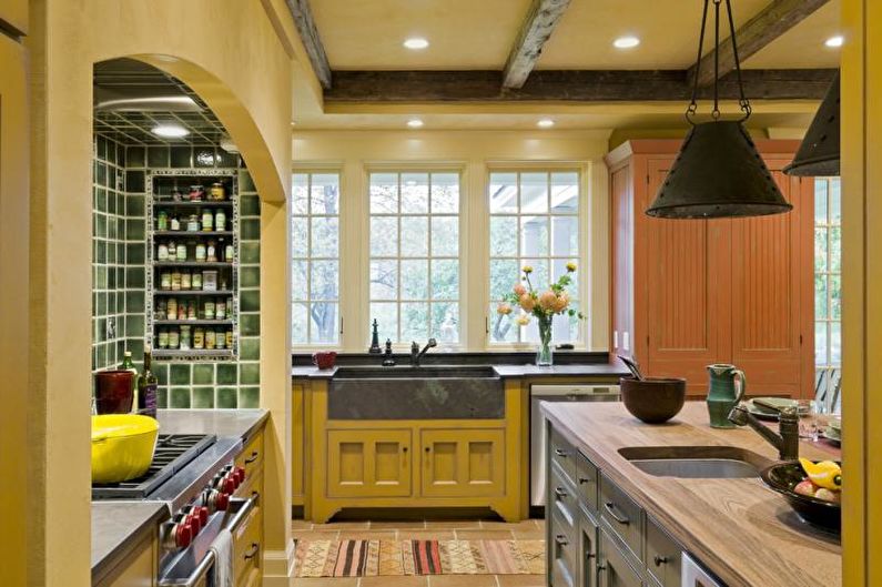
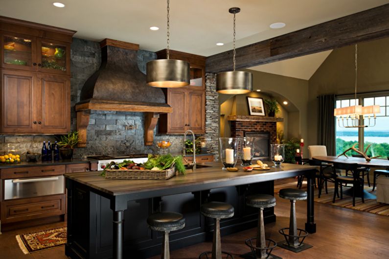
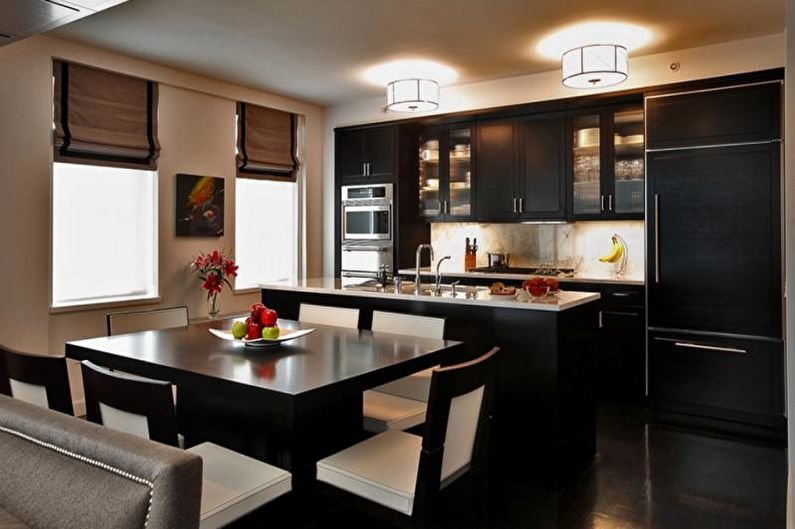
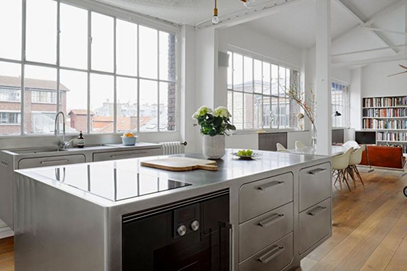
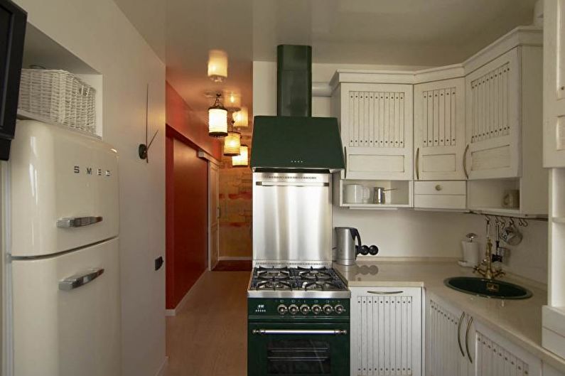
11. Home atmosphere
The professional design of the à la restaurant kitchen, in which almost everything is made of stainless steel, can be made more homely with the help of warm golden lights, as well as elements from unpainted wood, brick, chipped stone.
12. Headset as a work of art
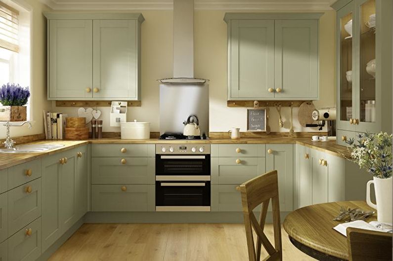
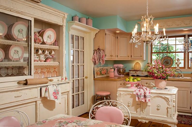
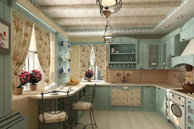
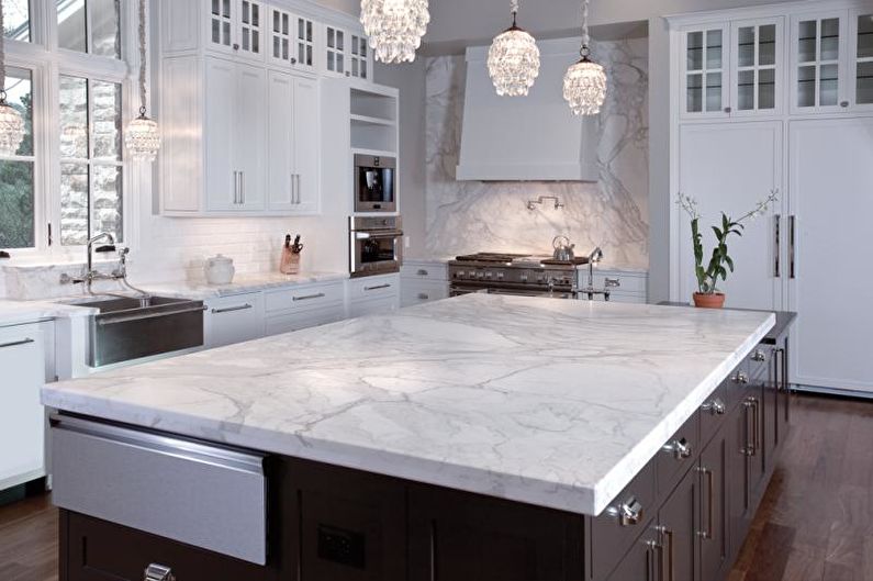
The calmer the colors of the headset and the finishes, the richer the facades can be decorated. Neutral beige, cream, olive cabinets are effectively complemented by patterned carving, delicate painting, beautiful panels, antique ceramic handles. This is a great option for cuisine in the style of Provence, shabby chic, English classics.
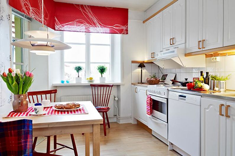
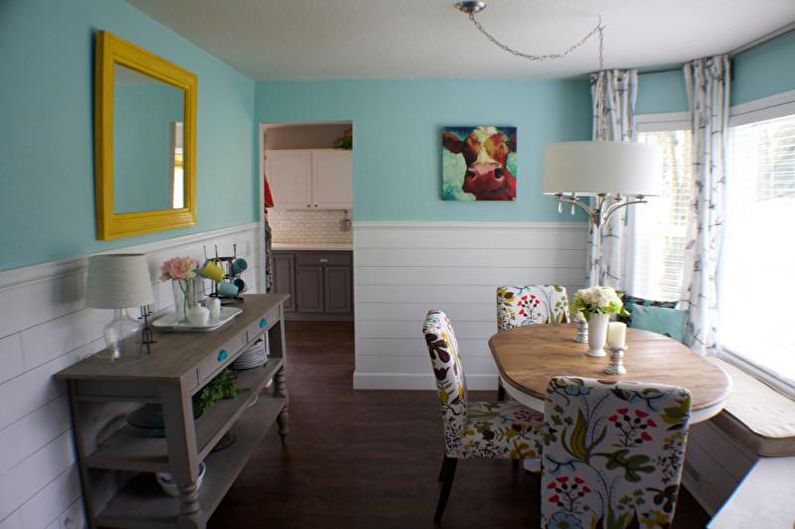
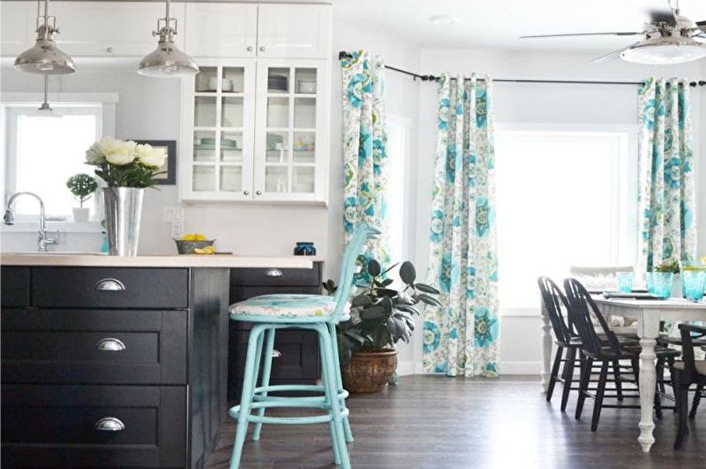
13. Notable accents
It is desirable to reflect bright colors of furniture in other details too - for example, choose curtains of the same shade, dishes, use harmonious upholstery of chairs or sofa pillows in color in the dining area.
14. Neutral base
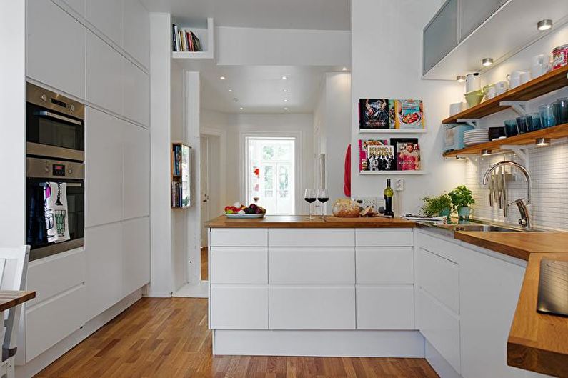
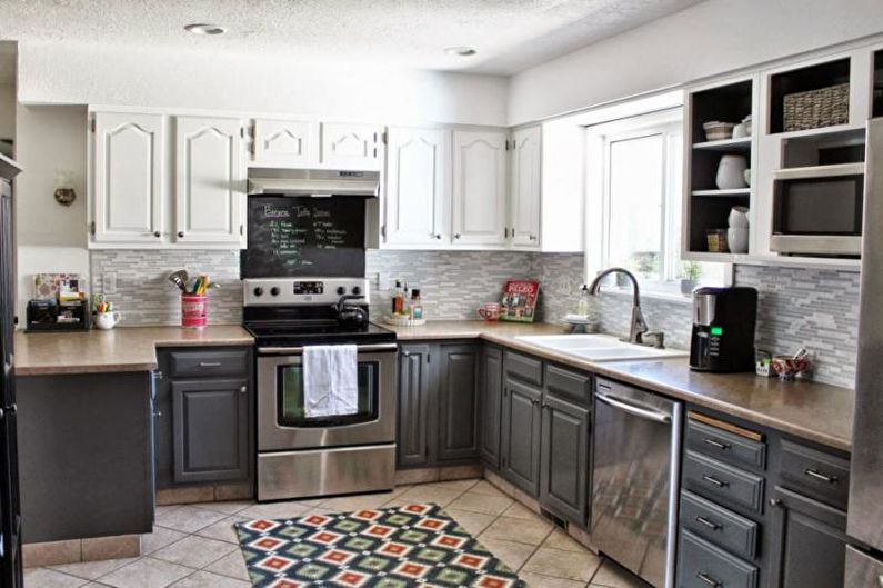
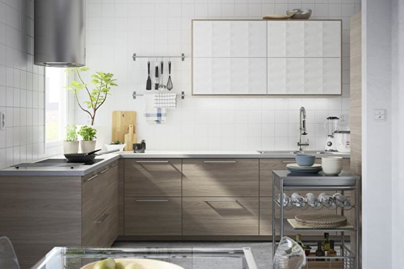
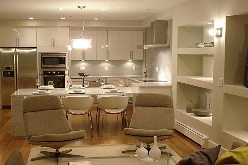
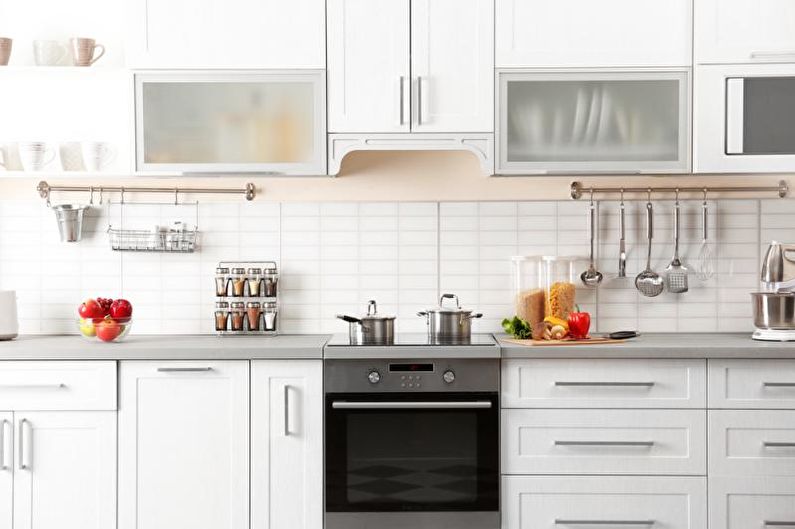
Whatever the kitchen, universal colors and textures can always be used in it and with everything. They help to dilute excessive brightness, reduce saturation and give the cooking zone a restrained appearance. This list contains all achromatic tones, that is, white, gray and black in any variations, beige-brown gamma (without yellow tint), unpainted wood and metals.
15. Cleaning issues
Choosing the shade of the kitchen, it is worth considering its practicality. So, on glossy surfaces, especially dark ones, every drop of water, fingerprints and traces of products will be noticeable, which means that taking care of them will require a lot of time and effort. For this reason, it is better if the countertops, as well as the space near the stove and sink, are non-marking. The ideal option is a natural marble or wooden texture, stainless steel, artificial stone matte colors.
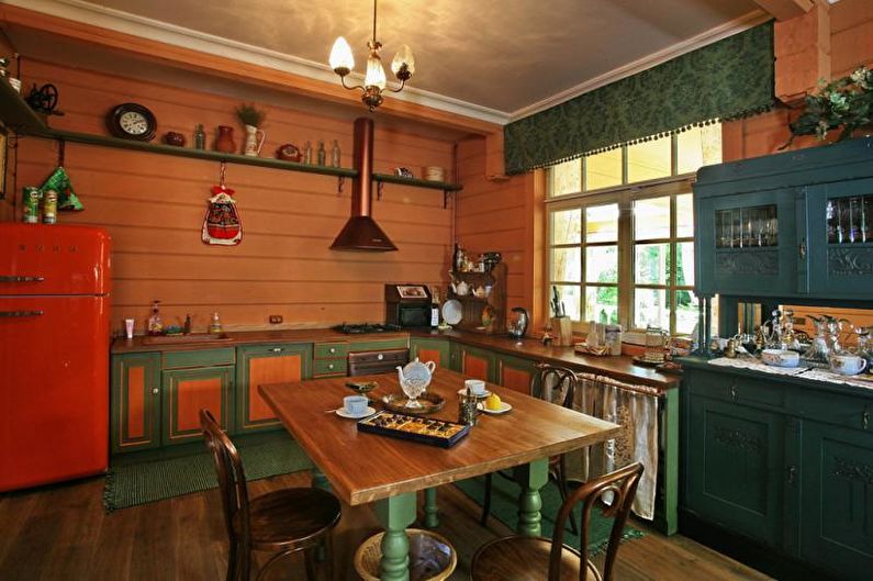
16. Household appliances in the interior of the kitchen
The headset should harmoniously fit in with large equipment. The refrigerator, oven, microwave, coffee machine and food processor must be selected in the same style as the kitchen. “Steel” models will look perfect on a plain pastel color background, black ones surrounded by bright colors, classic and provence can be complemented by household appliances with vintage gilding, decor, patterns, and the loft and avant-garde solutions will perfectly combine with retro technology.
17. Wall painting
When designing a small kitchen, it should be remembered that the clear contrast between the set and the wall visually reduces the room, including the height of the ceiling. It is better if the background decoration is the same color, only slightly lighter than large furniture. An apron is also most preferable to veneer with light glossy tiles, you can also stick photowall-paper with a perspective and protect them with transparent glass or immediately order printing on glass.
18. Soft combinations
Instead of sharp contrasts in a small cooking zone, it is advisable to use colors that are close in tone, for example, a tandem of pistachio with almond-nut, cream with soft pink, milk with coffee, etc.
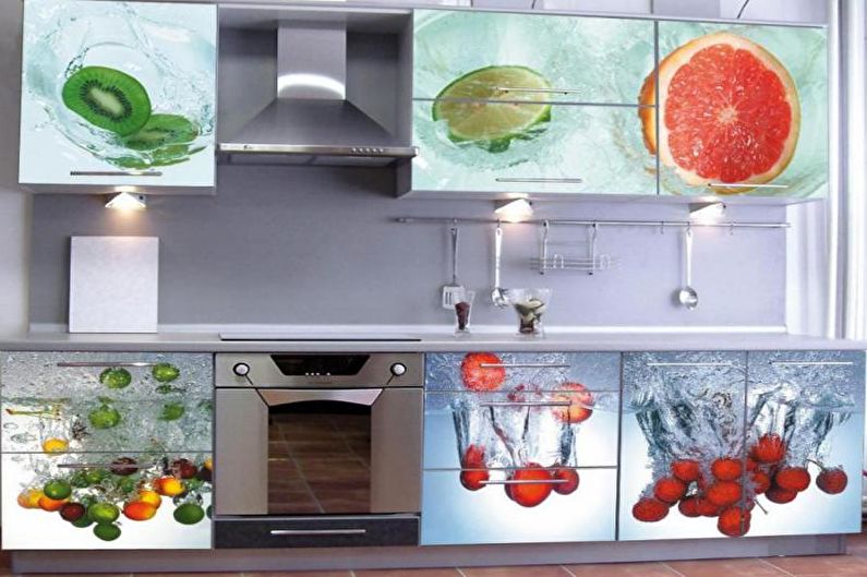
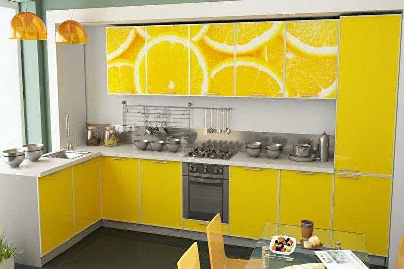
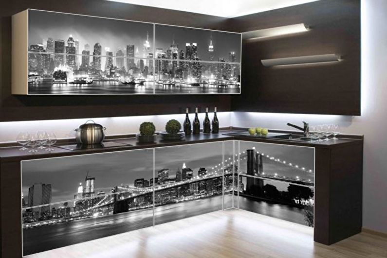
19. Image balance
If the headset has photo printing on the facades, the rest of the finish should be plain. Ideally, if the color of the walls will repeat the lightest shade of the drawings or just harmoniously combine with it.
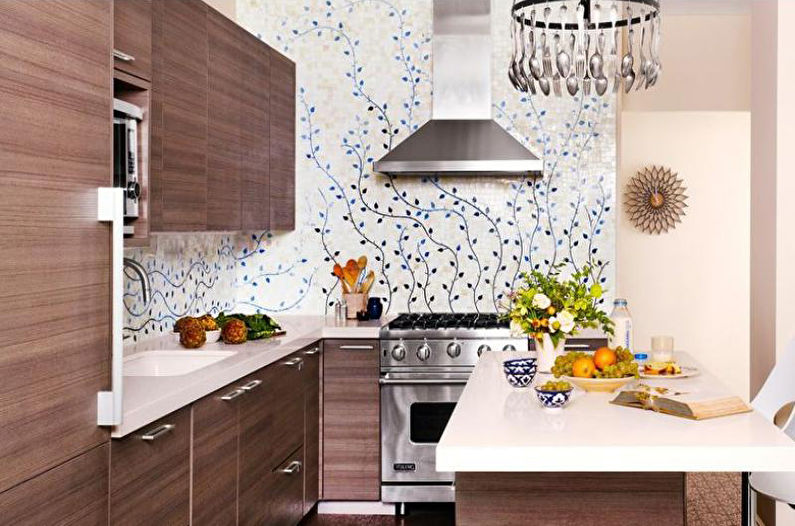
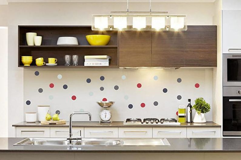
20. Prints in the design of the kitchen
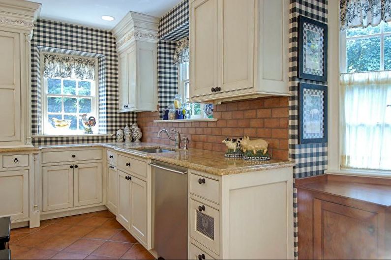
The monophonic design of furniture in some design options allows an unobtrusive picture on the walls. Depending on the style, it can be a small floral print, stripes, cage, images of various objects, newspaper, wooden, wicker texture, as well as all kinds of combinations of wallpaper, ceramic tiles, plastic panels, lining.
Video: Kitchen color - combinations, color of walls and furniture